 A chart is a graphical presentation of activities of all the participants trading in a particular market or the stock you are trading. Any trade which is executed in the market is not left unrecorded so each and every trade exchanged between the buyers and the sellers are recorded and presented on the chart by the fluctuation of price during a particular period of time.
So, a chart records activities of all the participants you can name or think of under any category:–
– Retail traders trading in small quantities with limited information and knowledge
-Corporates, financial institutions, insurance companies like LIC, mutual funds (HDFC, ICICI, DSP BlackRock) trading with big asset under management, access to technology, professional fund managers & well equipped market knowledge.
– Arbitrageurs trying to cash in the difference between the price in two different markets
– Speculators trading the markets with a motive to earn profits
– Hedgers entering the markets to manage & hedge their business risk
– Insiders trading the traders on some inside information which is unknown to the general public
– Investors investing in the markets via fundamentals
– Traders trading via technical charts, patterns, etc, and
– Even promoters of the company.
So, all the activities of the market participant with diverse trading objectives are recorded on the charts. A chart doesn’t leave any room for argument that an insider is manipulating the market and profits can be made only on insider information. As all the insider trades are even recorded on the charts and accessible to everyone out there as if some one has the positive information about a stock then same must be reflecting with increase in volumes and rise in price in that stock for the trading day.
This gives any technical trader a glimpse and understanding of behavior of all the participants combined together and an opportunity to follow the overall picture of the market and make smart returns.
What is Chart Reading?
Understanding difference between Fundamental vs Technical Aspect of Trading
Fundamentals is study of how well a company or a market, you are interested to invest or trade in, is likely to perform in the future. An analyst work starts from gathering and assembling all the information about the company, economy and the industry to evaluate and judge the growth prospects of the investment while on the other hand, technical`s is the study of the behavior of the participants exchanging trades among them in that particular market or stock.
So, fundamental analyst analyses the company (Say “A”) he/she is interested to the invest in while a technical analyst analyses the buying and selling behavior of the market participants trading in the same company “A”.
Therefore, Charts are the basis for the technical trader to record, construct and monitor the market movements as these price movements will help him/her to determine when and how to enter a trade and how to continuously manage the trade and determine the exit point as per the movements on the chart.
Does Charts Represent the True Picture of the Market?
Charts are the true reflector of the trend of the market as price movement register the total demand and supply in the market. Price movement tells us what the overall market participants are expecting as the price cannot move up unless there is more buying than selling and it cannot go down unless and until there is more selling than the buying. Buying and selling activities of the market participants are in-turn influenced on the expectations of the future events or situations which forms the basis of the price movements in the market.
Does Charts have Fundamental Element in it?
#1. Principle of Discounting
Markets discounts and adjust in the price movement all the information available with all the diverse market participants well in advance i.e. it discounting the future events.
Every movement in the market is the result of the expectation of the market participants of the future events and markets foresee these future events well before it is disclosed or available in the market to the general public at large. Any company with good fundamental element will be backed with more buying in the market and which is surely recorded in chart with higher prices.
All the participants in the expectations of the some future events [Companies Financial Result, Economy Data (Inflation, GDP Growth Rate), RBI Monetary Policy (CRR, Repo Rate Cut), etc] prepares and take some positions (Bullish or bearish) in the markets before these events happens and that is the reason when a market forms a positive or negative trend it continues on for a smaller period of time (Intermediate trends for few days to weeks) to a longer period of time (Cyclical trends which persists from few months to years).
For Example, In hope of a Rate Cut by RBI (Reserve Bank Of India) in the forthcoming monetary policy, due to falling inflation and rising economy growth rate or any other reason, market participants start to build up buying positions in the market (Specially Banking Stocks) which will force the prices to rise before the news actually comes public.
Also, there are insiders who have access to some information (say companies increasing sales and profits) before it is known to public. So they started building on their positions well in advance which leads to a rise in the price of the stock which makes the chart form up Higher Tops & Higher Bottom (Up Trend) on the charts.
A traders job is to evaluate whether these events are already discounted on the charts or not. As any big up pile move before any positive news break out in the market can leads to reversal of the positive trend as the same could have been discounted and adjusted in the price movement well in advance.
So, there are all different kinds of participants with diverse trading objectives where some has access to insider information while some are intelligent who understand the trading business and they take positions well in advance accordingly. That is why when a positive trend starts it continues on for a long period of time.
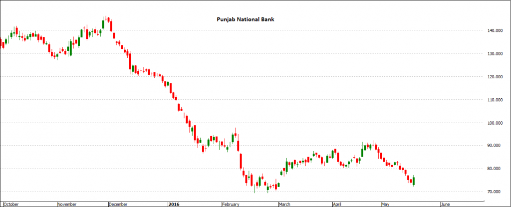
For Example, on May 18th, 2016, Punjab National Bank (PNB) announced the highest quarterly loss ever reported by an Indian Bank of Rs. 5367 crores but the stock was hammered down way earlier from 140 to 73 from December to Feburary. The market participants and those predicted that this will happen started selling this from the few quarters before. Refer below chart -1
Chart 1 – Punjab National Bank EOD (Oct 2015 – May 2016)
#2. Reason for Under-Performance and the Out-Performance on Charts
Any good prospecting company with much better growth in sales, earnings, business stability and better future prospects compared to its competitors will surely attract more buying interest in the market than others in the industry. This will surely be presented on the charts with much higher and sustained prices in the outperforming company than the under-performing one. As markets have a tendency to give higher ratings to the company with better growth trajectory and prospects than the average industry standards which will in-turn have much more interests from the market participants thus higher growth in the stock prices than the others in the industry.
If we refer to the chart above of Punjab National Bank, the bank had a big line of Non-Performing Assets (NPAs) which leads them to suffer big losses as compared to others in the banking space that is the only reason why the stock under-performed and suffered big blow down than the others.
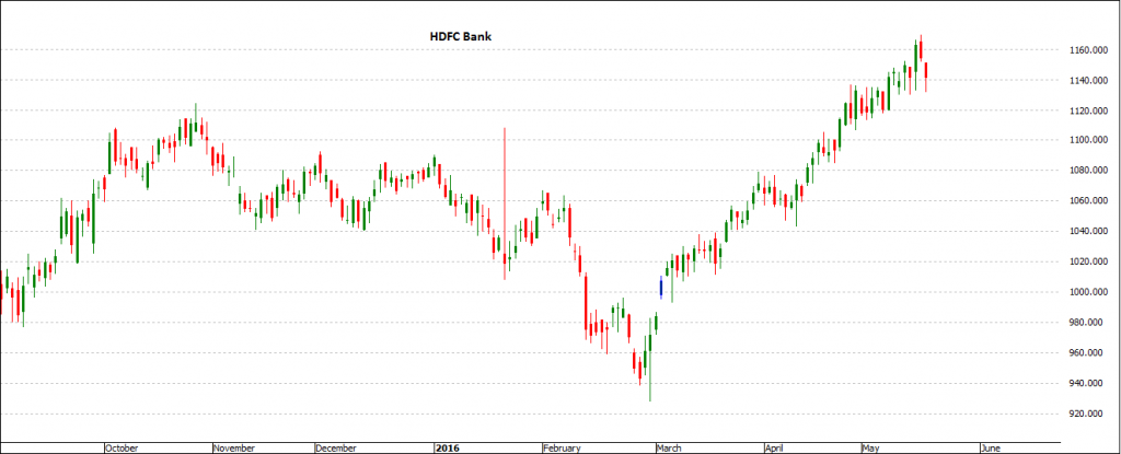
If we compare the performance of PNB with HDFC Bank fundamentally, HDFC outperformed the performance of PNB where HDFC posted a quarter net profit of Rs. 3374 crore with a 20% growth while PNB posted net loss of Rs. 5367 crores during the same quarter.
That is the reason why HDFC Bank outperformed PNB on the charts where stock hovered within 950 to 1150 during the time when PNB hammered down from 150 to 70 price levels. Refer Chart 2
This proves to the point that the out-performance / under-performance on the charts are solely dependent on the fundamentals of the companies under comparison.
Chart 2 – HDFC Bank EOD (Oct 2015 – May 2016)
Why Technical`s?
Human behavior generally have same psychological element of fear and greed, and we tends to behave similar in similar situations or circumstances (of course with different degree or magnitude). We also have an in build habit of evaluating and comparing things and situations with similar ones happened earlier i.e. why market moves repeatedly in same fashion again and again in Cycles.
So, researching the past activities of the market participants gives a trader an advantage of understanding what all the traders combined together are expecting the market to do which can continue on for a longer period of time i e. why market forms up similar Setups or patterns in similar situations.
Types of Charts
There are many different types of charts that can be constructed but we tend to differentiate them into two sets.
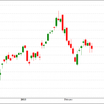
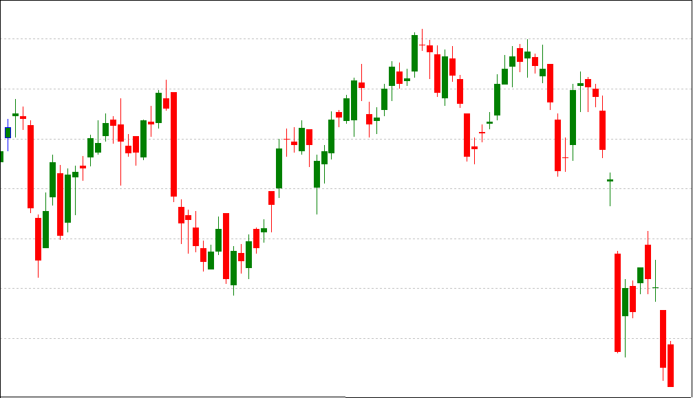
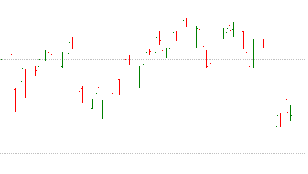
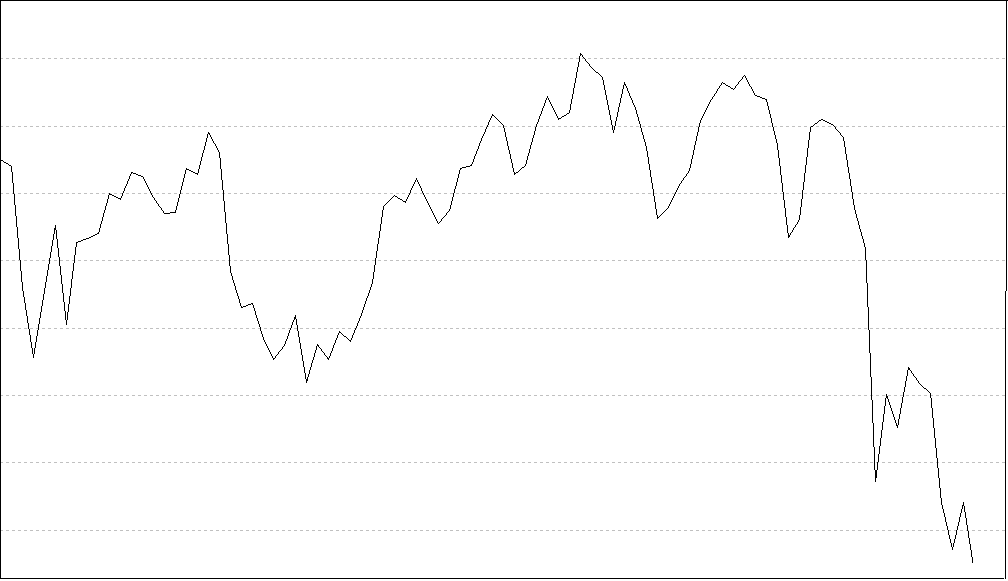
#1. Line / Bar / Candlesticks Charts
These charts are the general ways of representing the price fluctuations. Each one of them gives a different edge to the trader while evaluating the market movements where Japanese candlesticks considers Open, High Low and close of the bar while line chart considers only the closing of the bar.
Candlestick Charts
Bar Charts
Line Charts
Every Candlestick or Bar is formed for a certain period of time. Like a 5 Min Candlestick will show the activity of the market during that 5 minutes. Similarly. a 15 min Chart will show the market movement in those 15 minutes.
When 5 minutes are over, a new candle starts while 15 minutes candle is underway to form. So on completion of 15 min, we will have one candle on 15 min chart, while three candles on 5 minute chart.
#2. Swing Charts
Swing charts are an extension version to the basic version. Swing charts helps a trader to avoid a lot of market movements which are out of the fixed denominator factor for the evaluation. These charts can be constructed on the basis of considering atleast some specific price point movement say 100 points or time movement say 1 day, 2 day or 1 week. So, any price or time movements which is less than the pre-defined denominator will be avoided and trader will pay no attention to such movements.
KNOWLEDGE IS POWER!